
How to optimize website template images without losing the design
Audit image sizes, replace responsive sources safely, and verify the built site. A practical React template guide with measured file examples from Gridcraft.
By Templa · 5 min read · · Updated
Key takeaways
- Measure the image requested by the browser, not only the size of your download ZIP.
- Keep responsive image references consistent when replacing portfolio work.
- Preserve the crop and clarity that make the design useful.
- Check the built site on a narrow and a wide screen before publishing.
Start with an image inventory
A website template can include several versions of one image. That is useful when the browser can select a suitable version; it is not evidence that every version downloads on every visit. Begin by identifying the hero, portfolio thumbnails, project images and decorative graphics. Record where each is used and whether the page uses an img element, a picture element or a CSS background.
Make a backup before replacing anything. Follow the React template launch guide to run the package. If you are still changing the identity and page content, read the agency customization walkthrough first.
What we found in a real template package
We inspected the Gridcraft React/Vite download supplied by Templa. One project image had the following files under its public assets. These are actual decoded dimensions and file sizes from that ZIP, recorded on 9 October 2026.
| Source variant | Actual dimensions | File bytes |
|---|---|---|
| Full-size PNG | 2352 × 1040 | 1,308,545 |
| 2000-pixel PNG | 2000 × 884 | 733,264 |
| 1600-pixel PNG | 1600 × 707 | 508,331 |
The filenames end in Project-Main-Img-06.png, Project-Main-Img-06-p-2000.png and Project-Main-Img-06-p-1600.png. They share the same asset prefix. The 1600-pixel variant uses 800,214 fewer file bytes than the full-size version. That comparison describes these files only. It is not a measured reduction in page load time, browser traffic or Largest Contentful Paint.
Do not delete the full-size version simply because it is larger. A wide project page may need it. Instead, check which source the browser chooses for each layout and whether the selected image stays clear enough. The package's public folder also contains other project thumbnails and images; this example is not a total page-weight report.
Update every responsive reference
In the inspected Gridcraft source, media references are kept in src/content/media.js. Some values represent a single path; others contain multiple image candidates. Search for the image filename and inspect the component that uses it. Replacing one file while leaving the other candidates untouched can make the old project return on another device.
For ordinary responsive images, srcset describes candidates and sizes describes the rendered slot. Width descriptors must match actual image widths. The browser chooses a candidate using layout and device information. Use picture when a mobile layout needs a deliberate alternative crop. A smaller viewport does not always choose the smallest file, so verify rather than assume.
Keep a simple record of the old paths, new paths, dimensions and pages affected. This makes rollback easier when an image unexpectedly changes somewhere else.
Choose a format without damaging the design
Compare candidate encodings at the actual display size. Text inside screenshots, small interface details, edges and transparency deserve particular attention. Exporting a photograph and exporting a screenshot are different tasks. Keep the original while comparing alternatives, and use a format supported by the browsers your customers need.
Do not rename a PNG file to .webp and expect a conversion. The encoded image has to change, and all references must match the result. Check transparency against the real background and inspect the narrow-screen crop before accepting it. There is no universal quality setting that produces the right balance for every template image.
Reserve space and load images deliberately
Provide image dimensions so the browser can reserve space. Off-screen images can use native lazy loading; avoid delaying an image that is important in the initial viewport. If measurements show an image is the LCP element, inspect its request timing and loading priority. Do not mark every image as high priority.
Keep descriptive alt text for images that convey information. A useful project preview description explains what the visitor is looking at. Decorative artwork can use an empty alt attribute. Do not turn alt text into a list of unrelated keywords.
Verify the production output
Run the package's complete build script, not just a screenshot of the development page. For the inspected Gridcraft download, the build also writes route entry documents. Check the generated production site and open an inner page directly.
Use this repeatable checklist:
- Choose one page and record its viewport, device scale, browser, cache state and network conditions.
- In the browser's Network panel, identify the actual image URL and transferred bytes. File size in the ZIP is a separate measurement.
- Inspect the image at its rendered size: lettering, faces, project subject and crop.
- Repeat on a narrow screen and a wide screen, keeping each comparison's conditions consistent.
- Check navigation, direct page refreshes and the contact or conversion path after changing media references.
- Compare performance runs under the same conditions, and keep the results with the source change.
One lab run is not a guarantee of every customer's experience. If real-user data becomes available, use it alongside lab testing. Image work can help, but fonts, scripts, server response time and animations can also affect the experience.
Choose a template or get implementation help
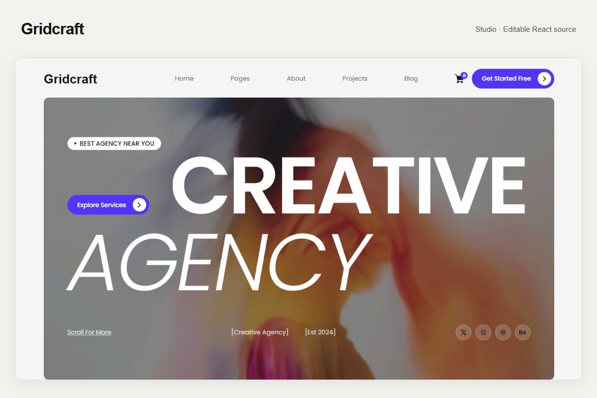
Browse the agency and studio collection, or examine the actual Gridcraft preview and product details. Confirm the source stack and included pages before choosing a workflow. This guide describes editable React source; it does not turn a download into a native Webflow Designer project.
For a project involving new crops, asset replacement or a deployment review, see Templa custom services and send a brief with your template and intended changes. Scope and testing need to be agreed for the actual project.
The short version
Inventory first, change references together, preserve visual clarity, and verify the production site. Use measured image requests and repeatable conditions to assess a change. A smaller file can be useful, but it is not by itself proof of a faster or better website.
How this guide was prepared
Templa inspected the Gridcraft customer ZIP and decoded image dimensions to prepare the file table. The article was AI-assisted and checked against that inventory and the linked technical documentation. No image conversion or before-and-after browser speed test is claimed in this guide.
Questions & answers
Does a smaller ZIP mean my website loads faster?
Not necessarily. The browser requests the assets used by the page, sometimes selecting responsive variants. Measure the actual image requests and page performance under repeatable conditions; ZIP size is a different measurement.
Should I lazy-load every image?
No. Lazy loading can help with images outside the initial viewport. Avoid delaying important initial images, particularly an image identified as the LCP element. Check the actual page rather than applying one setting everywhere.
Where are Gridcraft image references stored?
In the inspected Gridcraft package, src/content/media.js holds media paths and responsive candidate strings. Inspect the consuming component and all matching references before changing or removing assets.
Have these changes been proven to improve Gridcraft load time?
This guide reports measured file sizes and dimensions from the package, not a before-and-after page performance experiment. You need comparable browser or real-user measurements to make a load-time claim.